The Opportunity
When I joined Spotlight Reporting, there was no component library or overarching design system. Recognising the need for consistency, efficiency, and scalability, I made it a priority to establish a well-structured and cohesive design system from the ground up.
My Role
As the sole product designer, I worked closely with the front-end development team to understand both the existing product structure and the current product design and delivery processes. My goal was to build a unified design system that would improve consistency, streamline workflows, and enhance collaboration between design and development.
Step One: Creating the Figma Component Library
To build the component library, I followed the atomic design methodology, which I had successfully used in the past. The process involved:
- Auditing Existing Components – I conducted a thorough review of our product’s UI components, identifying inconsistencies and areas for improvement.
- Planning Improvements – Based on the audit, I developed a structured plan to refine and standardise components. I then presented this plan to stakeholders for approval.
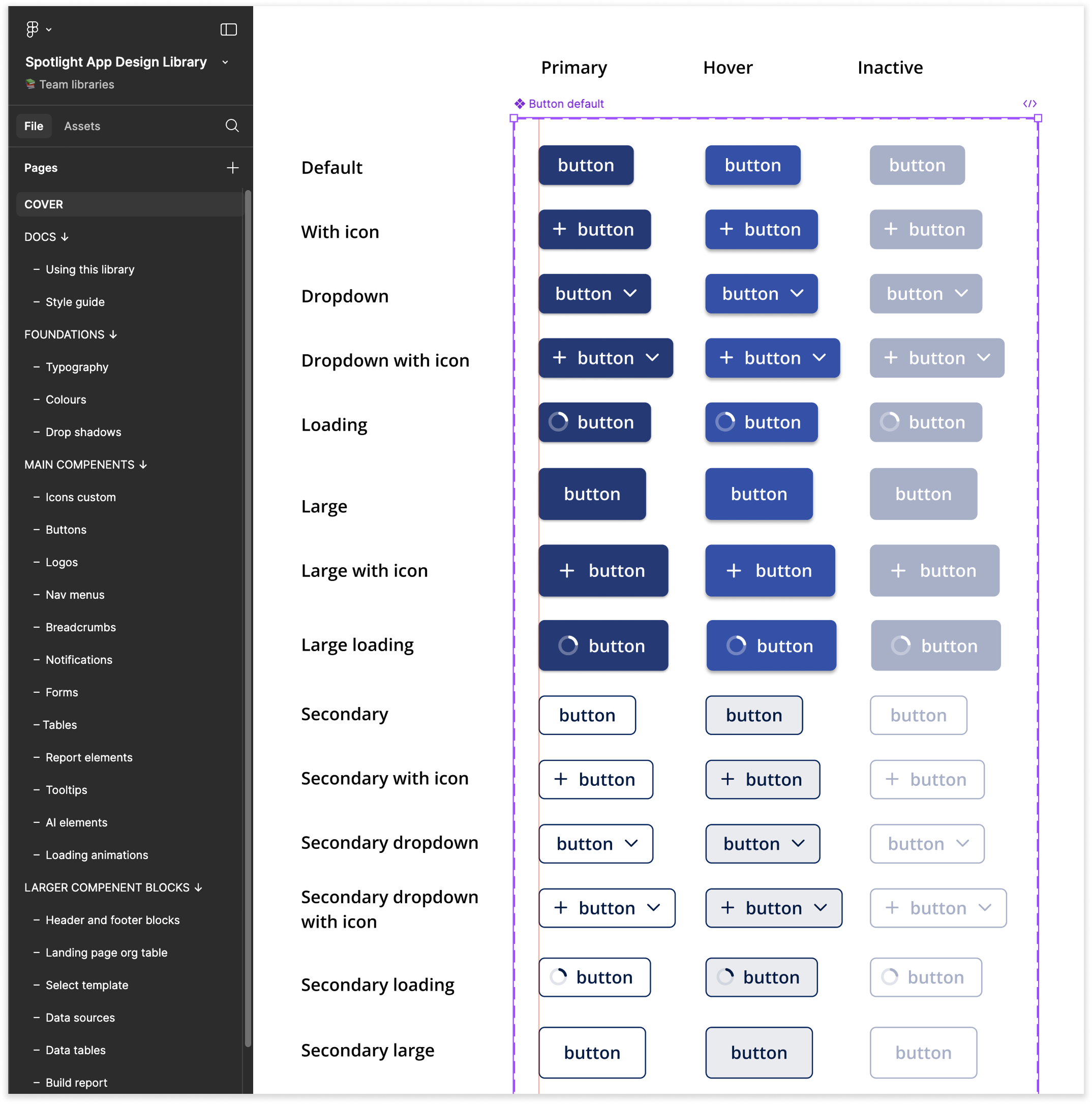
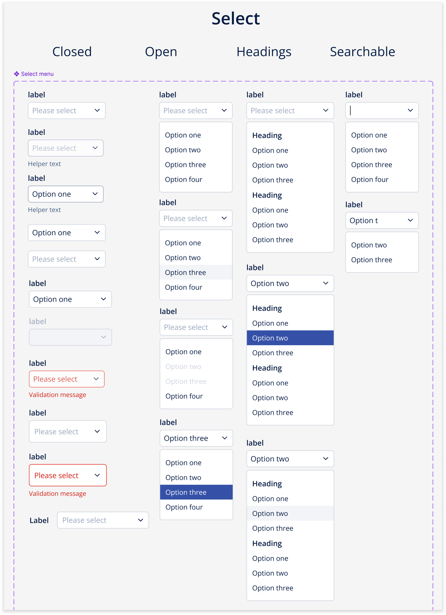
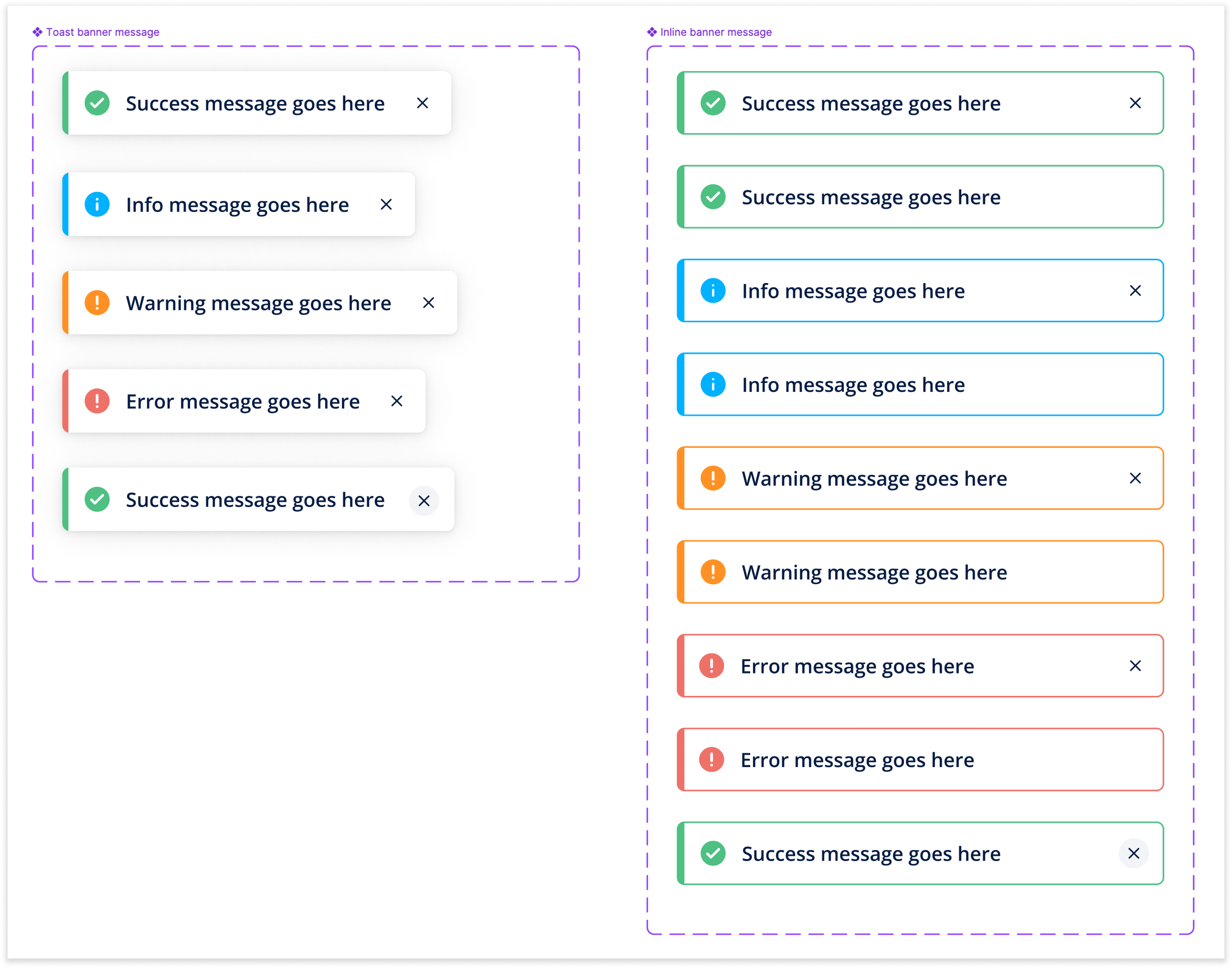
- Building the Library – Once approved, I designed and implemented the new component library in Figma, ensuring components were modular, scalable, and easy to use.
- Collaborating with Developers – I worked closely with the front-end team to translate Figma components into reusable, coded components.
Step Two: Establishing a Style Guide, Component Guidelines & Design Principles
Beyond the component library, I created a comprehensive style guide to define:
- Typography – Standardising font styles, sizes, and hierarchy.
- Colours – Defining a structured colour palette for UI consistency.
- Spacing & Layout – Setting clear rules for margins, padding, and grid usage.
- Iconography – Establishing a consistent approach to icon use.
Additionally, I developed component guidelines to ensure clarity on how to use and extend the design system, as well as a set of design principles aligned with our company values. These resources help maintain a cohesive experience across all products.
Ongoing Work
With the foundation of our design system in place, we are now well-positioned to:
- Improve existing features by applying consistent UI patterns.
- Streamline new feature development by integrating the system into our design and development processes.
- Evolve the design system as the product and company grow.


